Plotting maps in Python

Python is great for processing and visualizing data. Today I’d like to share simple tips around plotting data on map using Python.

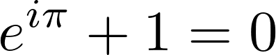
Let’s consider following example: I want to plot a map of airports around the world. Data for the airports can be obtained from OpenFlights:

        
from io import StringIO
import pandas as pd
import requests

csvString = requests.get("https://raw.githubusercontent.com/jpatokal/openflights/master/data/airports.dat").text
csvStringIO = StringIO(csvString)
airports = pd.read_csv(csvStringIO, sep=",", header=None)
        

This will download the data and create a Pandas DataFrame. We can plot airport locations:

        
import matplotlib.pyplot as plt

ax = plt.subplot(1,1,1)
ax.plot(airports[7], airports[6], 'r.', ms=.5)
plt.axis([-180, 180, -90, 90])


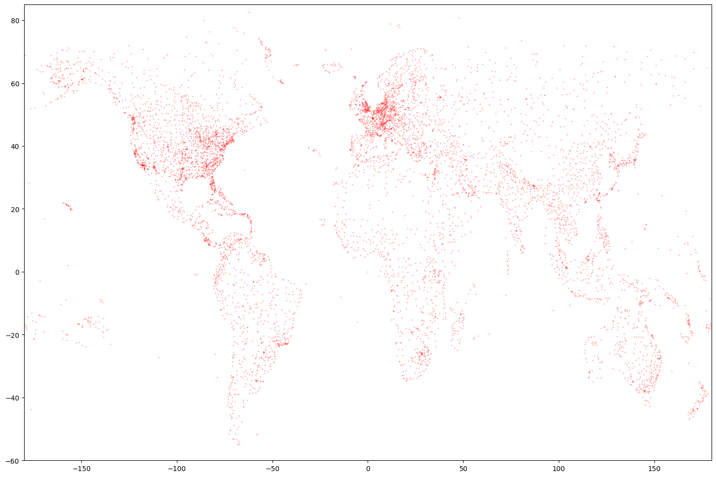
Nice plot, but not really a map yet. We need to add some contours. A Global Self-consistent, Hierarchical, High-resolution Geography Database (GSHHG) is a good place to start. You can get data and more info here: http://www.soest.hawaii.edu/pwessel/gshhg/. I recommend downloading “GSHHG coastlines, political borders and rivers in shapefile format (zip archive)”. Now we can plot much nicer map:

        
import geopandas as gp
import matplotlib.pyplot as plt

coastline = gp.read_file('/media/RAID/DATA/GSHHG_2.3.7/GSHHS_shp/f/GSHHS_f_L1.shp')
ax = plt.subplot(1,1,1)

coastline.boundary.plot(ax=ax, edgecolor='black', lw=0.5)

ax.plot(airports[7], airports[6], 'r.', ms=.5)
plt.axis([-180, 180, -60, 85])


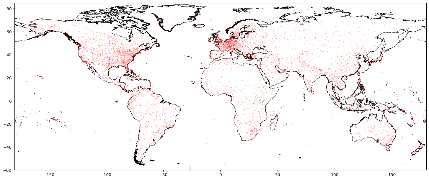
Or going one step further:

        
import geopandas as gp
import matplotlib.pyplot as plt

coastline = gp.read_file('/media/RAID/DATA/GSHHG_2.3.7/GSHHS_shp/c/GSHHS_c_L1.shp')
borders = gp.read_file('/media/RAID/DATA/GSHHG_2.3.7/WDBII_shp/c/WDBII_border_c_L1.shp')

lakes = gp.read_file('/media/RAID/DATA/GSHHG_2.3.7/GSHHS_shp/c/GSHHS_c_L2.shp')

ax = plt.subplot(1,1,1)

coastline.boundary.plot(ax=ax, edgecolor='black', lw=0.5)
borders.plot(ax=ax, edgecolor='black', lw=0.25)
lakes.boundary.plot(ax=ax, edgecolor='black', lw=0.25)

ax.plot(airports[7], airports[6], 'r.', ms=.5)
plt.axis([-180, 180, -60, 85])


Note that in the last example we used “crude resolution” of the coastline and borders – we don’t need much detail for a map in such scale.

Another source of shapefiles with borders that I recommend is GADM. You might be interested in looking at one of my public repositories for more details: GADM-consolidated-shapefile.

| comments

Generating images with LaTeX equations

Sometimes it is useful to generate an image (like a PNG file) with a high-resolution mathematical equation. I know that there are online tools for doing that but imagine you are like me and prefer getting things done “in-house”.

I will assume you have docker available (if not, go to https://www.docker.com/ and install Docker Desktop).

In the first step we will need to get two images from Docker Hub (we do that in terminal / command line):

docker pull miktex/miktex
docker pull dpokidov/imagemagick

Both commands will download some stuff and should be ready in a minute or so. Now we will need our LaTeX code that defines the equation:

\documentclass{article}
\usepackage{amsmath}
\pagenumbering{gobble}
\begin{document}
\begin{equation*}
e^{i\pi }+1=0
\end{equation*}
\end{document}

Now assuming that the LaTeX code is saved in test.tex file we will need to execute 3 steps:

docker run --rm -v miktex:/miktex/.miktex -v $PWD:/miktex/work miktex/miktex latex test.tex
docker run --rm -v miktex:/miktex/.miktex -v $PWD:/miktex/work miktex/miktex dvipng -D 600 -bg Transparent test.dvi
docker run --rm -v $PWD:/imgs dpokidov/imagemagick imgs/test1.png -trim imgs/test2.png

The first command uses miktex/miktex Docker Image to “compile” out LaTeX file to DVI format.

The second command uses the same Docker Image to convert DVI into PNG image. Our LaTeX document has one page, so one PNG will be created after conversion (test1.png). Unfortunately, we are not done yet, because our PNG image has strange margins.

In the last step, we fix those margins by using dpokidov/imagemagick Docker Image. Our final result looks like this (test2.png):

| comments

Hi there πŸ‘‹

Hi, my name is Marcin. I’m originally from Poland but live in the Bay Area, California. Professionally, I’m a data scientist and a software engineer. I’m passionate about data science, machine learning, and software engineering. You can find out more about me on my personal website.

Now the fun part: why are we here? This is not my first attempt at blogging. I used to share interesting stories and projects on my previous personal blog. I published there in polish, so I decided to start a new blog in English. It has been a while since I actively posted (I did that in β€œwaves”), and the world has changed significantly. However, I still think a proper blog has advantages over modern social media.

I want to use this space to show exciting projects I’m working on after hours. There are two reasons for doing this:

  • Inspire others to do interesting things: there is a lot to experiment with and discover – you just need to start.
  • Inspire my future self to do exciting things: I love looking back, seeing interesting things I did, and appreciating the knowledge and experience it gave me.

I hope someone is actually reading this, and the content of this blog is valuable and inspiring.

| comments

« Newer posts